
02.01.2024 | Design
10 Top-Selling Benjamin Moore Paint Colours & How to Use Them
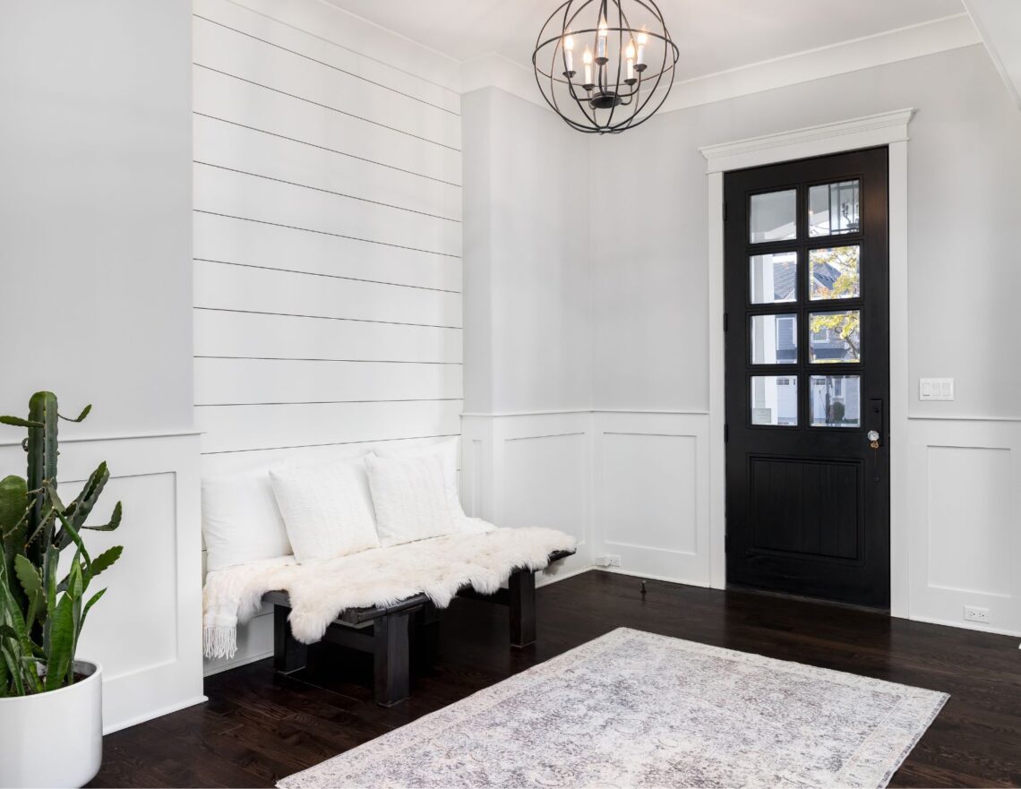
Benjamin Moore’s top-selling paint colours fall into the neutral palette – whites, creams, greys, and beige tones are consistently high on the list of homeowners and decorators. When selling a home, designers and stagers know the importance of a neutral backdrop to help potential buyers envision themselves in the space. If you want to repaint this year, either for a refresh or to prep your home for sale, these top ten paint colours are a wonderful place to start. Knowing how to incorporate the ‘right white’ into your home will ensure you achieve a warm and cozy look.
Best-Selling Benjamin Moore Paint Colours
1. Revere Pewter (HC-172):
Revere Pewter has consistently been one of Benjamin Moore’s top paint colours for years. The perfect neutral, revere pewter adapts to various light conditions, leaving a wonderfully warm finish.
2. White Dove (OC-17):
White Dove is perfect for those wanting a clean, bright white. Its warm undertones prevent it from looking stark or clinical and contrast wonderfully with bolder colours.
3. Edgecomb Grey (HC-173):
Edgecomb Grey is a greige neutral. Its calming, subtle tone is perfect for bedrooms and living spaces.
4. Grey Owl (OC-52):
Grey Owl is a pretty, soft grey that adapts beautifully to any space. It is a warm tone but can look cool in some lights because of its green undertones.
5. Cloud White (OC-130)
Cloud White is a soft, balanced go-to white with warm, invisible taupe undertones. It works best in rooms with plenty of natural light and is perfect for walls, cabinets, trim, or furniture.
6. Manchester Tan (HC-81)
A fresh, sophisticated beige, Manchester Tan is a versatile tone that works well in rooms with lots of light and darker spaces. It is a timeless colour that pairs well with warm finishes and touches.
7. Chantilly Lace – (OC-65)
A classic, go-to white, Chantilly Lace is fresh and clean. With grey and blue undertones, it’s a classic bright white that looks stunning in a space without feeling stark or sterile.
8. White Heron – (OC 57)
White Heron is a classic bright white with a slightly cool cast due to its green undertones. It sits in the middle, not too bright but not exceptionally warm.
9. Swiss Coffee – (OC – 45)
A warm white Swiss Coffee is a sophisticated and versatile tone. Off-white and creamy, with yellow/golden undertones, it works well in spaces where you want a cozy, warm feel.
10. Classic Grey – (OC-23)
Classic Grey is such a light shade that it can function as an off-white. Warm, with soft, muted undertones of a pinkish tone, it works best in a room with natural average light.
How to Choose the Right White
Choosing the right white for your space seems simple enough – Until you’re standing in the paint department staring at hundreds of paint chips that are only slightly different. Each shade of white has unique undertones and will look different depending on the space it is going in. Try the Benjamin Moore testers to find the perfect neutral when choosing from top-selling paint colours for your space.
- Evaluate the undertones. Every shade of white has undertones that will shine through in your space. They are either warm (red, yellow, or orange) or cool (blue or grey). The easiest way to tell the undertones is to bring a plain piece of printer paper to hold against the paint swatch.
- Look at the natural light in your space. A warm white will look best if it’s a darker room without many windows, even if it looks cream in the store—brighter rooms with tons of natural light pouring in work best with a neutral or cooler tone.
- Consider other neutrals. Maybe true white isn’t the answer. In a warmer home, taupe and greige in the lightest shades can have the same effect. A stark white won’t match the feel if everything in your home is warm.
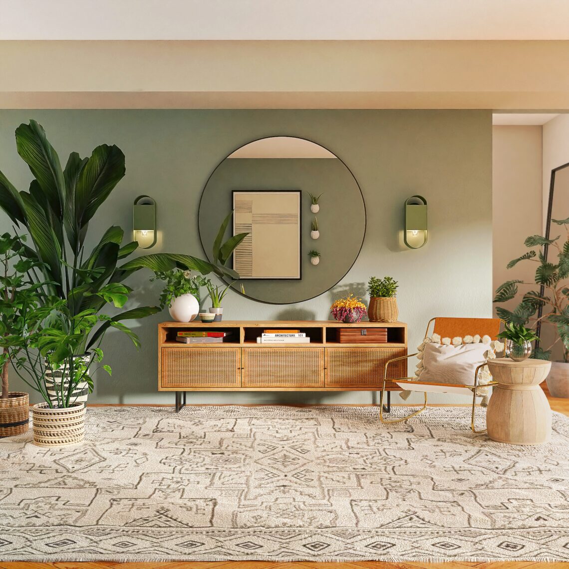
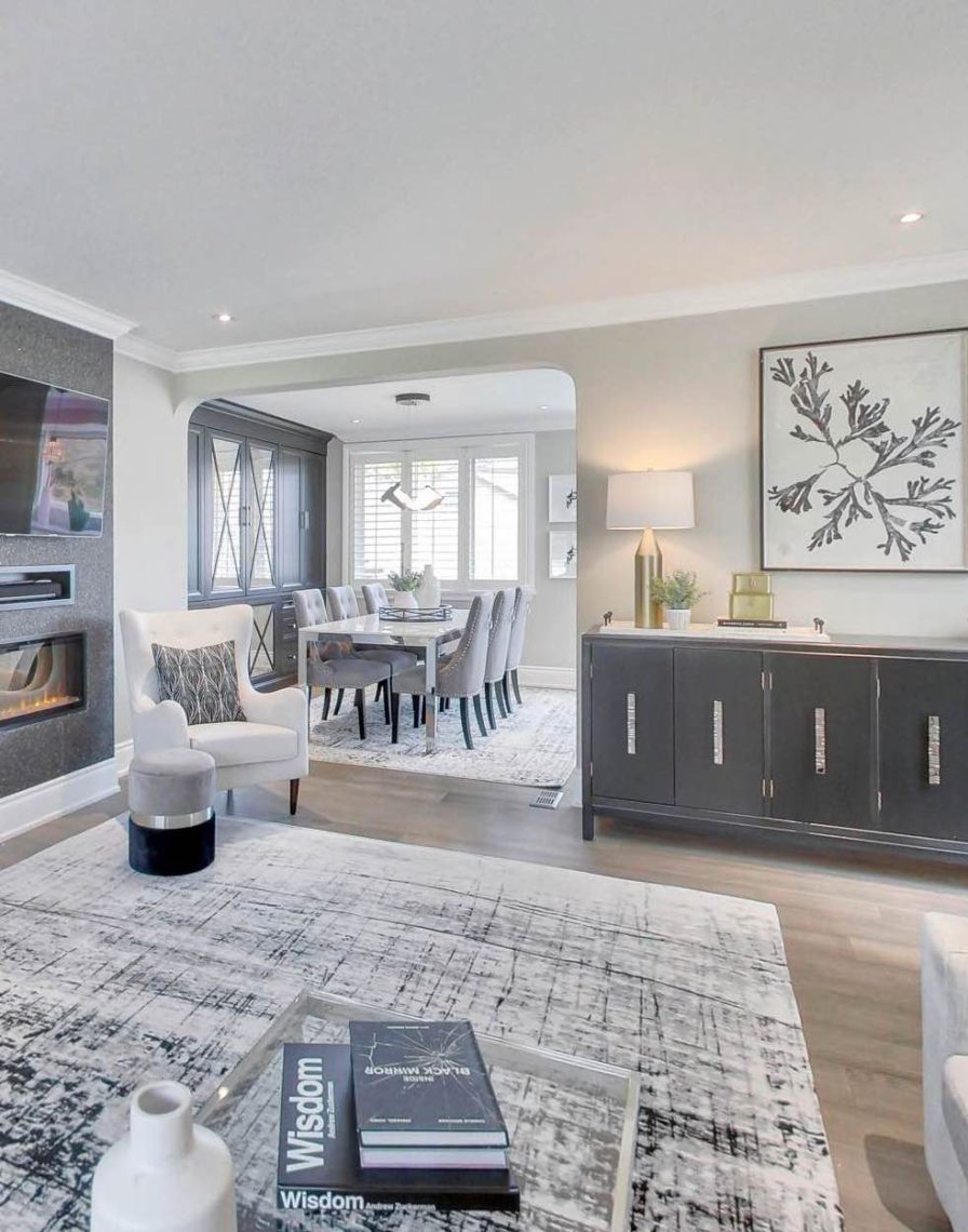
Using Whites & Neutrals in Your Space
Neutral home décor is perfect for creating a warm and cozy space. From a real estate perspective, we always encourage our sellers to keep the décor in their home as neutral as possible when it comes time to sell. If you’re choosing from any of the top-selling paint colours, you can’t go wrong. If you want to make whites or neutrals the primary shades in your home, implementing a few pro tips will ensure it doesn’t come off as cold, sterile, or just plain dull.
- Think outside white and cream. Black, grey, brown, beige and even some blues are considered neutrals.
- Choose multiple neutral tones to avoid a stark look. Mixing white or cream with beige or grey keeps things neutral while adding visual interest.
- Vary the finishes. Using the same shade of paint but in different finishes is another excellent way to add interest. Try an eggshell or satin on the walls and a semi-gloss on the trim.
- Keep neutrals on the walls and bring in pops of colour with décor and finishes. This is the perfect answer when staging your home, as it lets others envision adding their style into the space.
- Mix materials. Add warmth and interest with fabrics, patterns, or wood if your tones are primarily neutral. Adding interesting textures helps create a warm and cozy space.
- Pay attention to lighting. Changing up the lighting in a space can drastically alter the feel. Stark overhead lighting will bring out different undertones than natural light streaming in the windows.
You can’t go wrong choosing one of these top-selling paint colours from Benjamin Moore. Decorating your home with neutrals doesn’t mean stark and boring. Versatile and enduring, neutrals help create a warm, welcoming space.